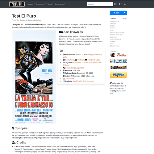
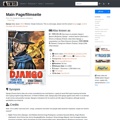
The cat’s out of the bag! I have decided to name the upcoming changes to the site “SWDb 3.0”. It will be one of the most substantial updates to the SWDb in many years, but at the same time not a lot of it will actually be visible. What will be visible will depend to some degree on how we can edit the content of the website so it will make use of the technologies that power the SWDb (or will power it once implemented).
I will need everyone’s help for testing and feedback before we can go through with it. So please bear with me for this longer post
In a nutshell, what’s changing:
- the website will look just slightly different (and it will hide the technical stuff to those not logged in) and have a sidebar
- improved responsiveness (will work and look better on all devices)
- more support for nice looking icons, tabs, accordions and other display options to make complex content easier on the eyes
- we will use this to give all film pages a major overhaul, see below.
There will be a lengthy forum topic on the changes once it’s all accomplished as well, so no worries.
BUT first and foremost, before we really kick it off, I would like to ask those interested in helping out to use the new foundations of SWDb 3.0 for a few more weeks and give it a real life test drive. We need to iron out all its kinks and test the nuts and bolts. I have been doing that already, own my own, for a few months now, some of the editors have too, and I am fairly happy, but some work is still ahead before we can throw this in front of the entire world.
Please (and mille grazie for doing that)
-
go to the site “Special:Preferences” once logged into the SWDb (instructions for those without an editors account, see further below): Log in - The Spaghetti Western Database
-
go to “Appearance” and selekt “Tweeki”.
-
Make sure responsive mode is checked.
-
Hit save.
-
Delete temporary files or “cache” of your browser just to be on the safe side. Please also do that on any mobile device you may be using the SWDb from, and I want to encourage you to use the SWDb from any crappy device you have. The better we test it from stuff people may be using, the better.
-
Use the SWDb as before, work with it, browse it, edit it. And report every problem, glitch, weird thing or annoyance to me as precisely as possible, so I can try and have it fixed / or fix it myself / or tell you why it’s meant to be like that on purpose haha.
Non-login option instruction for anyone to see a specific site on the SWDb in the “new look” (which is still under development): simply add an “?useskin=Tweeki” to any URL, for example if you want to see Roy’s Deadly Trackers review in the new look:
https://www.spaghetti-western.net/index.php/Deadly_Trackers_review?useskin=Tweeki
What do we want to accomplish before we give a final “green light” and start working on it all?
- We need to do more test driving before we let thousands of people enjoy this every day.
- Some things to test out for you: browsing around, searching, editing, uploading pictures, selecting categories, using the site on different sized screens and operating systems, printing pages, sharing content online, modernizing older content pages, etc…
- The centerpiece will be the new film pages, because that is what most people will use. My test page is this “fake” Django page (https://www.spaghetti-western.net/index.php/Main_Page/filmseite ). Questions for you: Does this cover all kinds of information a film page can have? What’s missing? Does it make sense? Is the order ok? Does this look okay on huge screens and small cell phones? Can you imagine any other film’s page be designed this way? One nagging thing is that posters have different formats, and sometimes there are less AKA titles, so the way this site will look if you resize your screen isn’t yet perfect…
Once we have that one page perfect, but only then (!), this is gonna be our template to roll it out across over 700 pages in the SWDb, and that is going to be the major work to be done until the end of the year, potentially. - But, before we do that, I’ll compile a checklist so we can divide out the work and nobody forgets anything. I still need to make some technical changes to that page, too, so it works better on mobile, that is still being worked on. You may notice that it is not exactly perfect if you resize your browser window from full screen to a small window, or use it on your cell phone, etc, but I am getting closer.
- Does the new main menu cover what the main menu should cover? What is content that is linked to from the main menu that urgently needs updating, improvement and expansion before we prominently send people in that direction?
- Are you okay with what is in the website’s footer? Is something missing anywhere in the user interface of the website that is urgently needed?
- Are you okay with the width of the sidebar, or could it be a bit wider? We will design some new graphics and buttons for it. Those currently visible there are placeholders.
- For editors, I have made a new profile page, how do you like it? See it here (remember above, how to add the new look to it
- Are there any other things you notice that should need fixing?
Many thanks for helping test and improve the SWDb.
Once everything feels right, we can move to implementation, and this will be the greatest change to the SWDb in years. People will really like it I am sure. I will need your help, because the SWDb is all of us - together, but I will do my best to assist and help us all divide up the work and since this is just for fun and a hobby, we will do it as fast as we can, but there is no need to go faster than that ![]()
Until then, enjoy test-driving SWDb 3.0 and please report everything in here.
Coming soon: Once the changes are implemented, there’ll be a 💡 What's new in SWDb 3.0 topic outlining all the new things.


