SWDb 3.0 is what we’re calling the winter 2022 update to the SWDb that brings a new user experience and … gradually… new pages design and other tweaks.
This topic is primarily aimed at our team of editors and contributors to familiarize themselves with the changes to the interface and functionality, but it may also be of interest to our regular users.
This topic is under construction / please note that it will be updated multiple times so it will be worth re-reading it at a later point, too.
1. Main menu bar
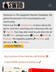
We have redesigned the main menu at the top of the screen (on mobile devices, a little hamburger menu folds it out, like here on the forums) to give you better access to the most important entry points into the SWDb.
2. The sidebar
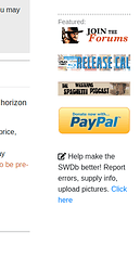
This is new. While it’s nothing revolutionary, it will give us a way to point out featured content and alerts that concern all SWDb visitors, no matter where you enter the SWDb. At the moment it includes a few buttons (forum, podcast, donation) and a quick link note on how to contribute.
3. The footer
OK this is rather minor as well, but the footer is also a bit new, and will likely change to give access to further information that should be a click away but don’t need to be in plain sight all the time.
4. Non-staff view and mobile compatibility
This is another minor thing, but the SWDb now shows even less techie stuff if you’re logged out so the majority of visitors will enjoy it more like a regular website. Even more than the previous site, it’s compatible across devices and all screen sizes - however this depends also a lot on how individual page content is set up so we need to work on making the content of pages behave better on smaller screens, as well. More on that later.
5. Grid layouts, tabs, icons and more content controls
This is advanced stuff, only read this if you’re an editor. The website’s content works on a 12-column grid, and depending on screen size, content takes up all 12, 6, or even less of that space, so the content can adapt. This becomes important when we redesign some content pages to make them work better across devices (for example: on bigger screens, content can be next to each other, on smaller screens we want content to drop to be shown beneath each other, and so on).
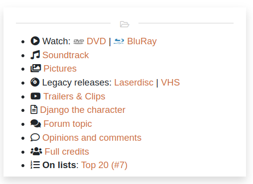
As for icons, the new layout supports a lot more pre-defined icons to be used in content. They will make stuff easier on the eyes and better to identify. It requires some experimentation to see which ones are included and which ones aren’t. There’ll be a small tutorial for editors on this later. See them used here, for example:
6. Content update campaign
Now let’s get to what we want to do to the content of the SWDb itself to make it a greater experience than ever before. We have picked five areas of work where we want to apply new formatting and other improvements.
6.1 Staff pages
Not too interesting for most people but important for the SWDb community to be more transparent about its work and make it easier for contributors to showcase their work. Basically, all contributors with user accounts in the SWDb will work towards revamping their own little corner on the SWDb more or less like mine does, or similar, or even better. Check it out.
Status: ![]() completed.
completed.
6.2 Pictures pages
What’s the main problem that plagued the pictures pages previously? Right, two main problems. First, thumbnails were too small and had no descriptions. Second, there weren’t enough pictures! We’re trying to fix both. Pictures pages will get better gallery views, we’ll add descriptions to images (e.g. “Lobby card, Spain”) and we’ll fill in the gaps. Please get in touch with images you have or found somewhere, we can’t cover them all!
Status: ![]() Better pictures is ongoing. New formatting and descriptions: not yet begun.
Better pictures is ongoing. New formatting and descriptions: not yet begun.
6.3 Film pages
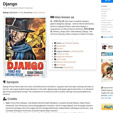
This is the main one. We want to apply a whole new look and feel to all film pages in the SWDb, that means over 700 film pages! We will start with the most popular ones, we’ll check what we might have to still tweak, and then roll it out to all pages. You can help us! Along with the look and feel, we’ll put everything in place for more useful information to be added. To cut a long story short, see the Django film page (here) for a preview. Also check it out from your mobile phone!
Status: ![]() Implementation mostly complete.
Implementation mostly complete.
6.4 Lists
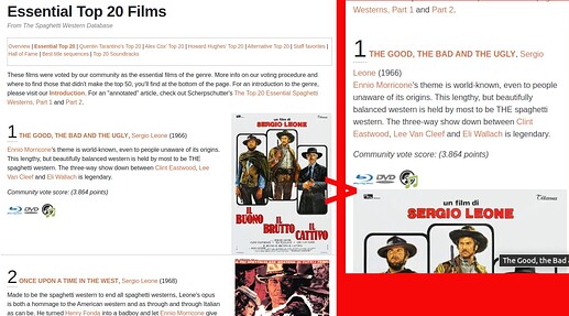
We are redesigning all lists pages so they look better across devices. We’ve already done that for our official Top 20 and a few more.
Status: ![]() In progress.
In progress.
6.5 Books
Our books library (which also extends to documentaries and other resources) will be updated to offer a more consistent and reliable experience, just like we have with DVDs. We’ll work to make the book pages look nicer, have more reliable content, and we will try and redesign the main books category to make it easier to find books (e.g. by language).
Status: ![]() Currently in progress.
Currently in progress.
As we are still testing SWDb 3.0, please refer to the testing topic for feedback and discussion:
