A few things. 1. How can I tell when others are logged in to the forum.
2. Can something be done about the back ground skin? IMO it needs color, its just too plain. If you want, I can post a pic to give an example of a colored one.
3. The avatars are way too small.
Heh, that’s it for now, other than that… great work Seb and your team too.
1 Like
- I’m afraid you can’t. In a lot of ways as explained earlier, even the old forum could only give an approximation based on session novelty. The closest you can currently get is by going to users and filter by today (link) or click on users to see when they were last active. There is considerable discussion in the community of Discourse itself (meta.discourse.org) as to ways of bringing this out in form of a plugin, and at the same time as to the value it would actually add. I agree that on a psychological level it might act as a stimulating parameter, but other than that it’s pretty much that. The forum shows you instantly and in real-time where latest activity is happening, so knowing who’s online won’t give you that much practical added value - at least not as long as there is no “live chat” built in. What could be done over time, is statistics as to how many per day, most active hours of the day etc… if you’re interested in that, I can check if that’s easy to find out.
- Well suggestions are always welcome, but it comes down to a few things like a) taste b) legibility c) you won’t see the background image on a small screen and/or d) it’ll mess with so many other color aspects of the forum that it’s more than just a matter of switching out one color. But again, I’m open to suggestions. Please bear in mind that 1) the SWDb also has a white background now and 2) there is a reason people buy books that have black letters on white paper

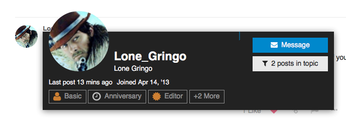
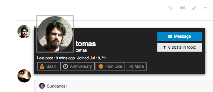
- Also a tricky topic. I have spent considerable time also reading up on this at meta, and it’s not super easy to implement (yet) as it breaks a lot of things changing avatar size. The other aspect is that it will go at the expense of screen real estate and mostly focus: when reading a debate do you really want other people’s avatars in your face all the time, or really just the discussion. I think they found a nice balance, but it could be that future versions of the forum software allow for a granular adjustment. In the mean time if you feel like you’re mixing up folks because they have similar avatars, click on them, it opens the neat hovercard, see the example:

1 Like
Yes, I remember it was a relief. Finally, within the law!
1 Like
The new forum just told me that since I had posted more than 30% of what had been posted in the soundtrack news topic I should perhaps let someone else participate as well 
1 Like
Ha, ha you have been told 
I’ve had a similar message in this very thread where it said “I’m replying a lot, maybe I should give others some space or use one post with mentions to react to a lot of others”. While on the one hand it’s a bit funny, on a more serious note this software is built for “better” community discourse (it is called Discourse) and so there’s a few things happening around that will time and again nudge the community towards more quality. Not allowing single word replies is one such example. If you agree with someone or like what someone posted, just click the little heart 
Ah I do understand just thought it a little funny
That said, I am going to meet the forum software at dawn for a quick duel.
2 Likes
@Richard_W also of course, we’re here to help. I think once the learning curve is overcome, nothing will stand in your way I am also doing my best to compile a few tutorials and screenshot-assisted “how to” pages
Haven’t been on the forum for a long time, and wanted to check out what is new and has changed.
As this is the topic to talk about the new layout, I can only honestly say that I find it to be horrible.
There’s no sense of structure, of borders, or anything to cling to. Like many said, everything seems to be floating in mid-air.
I don’t like it at all that there are no pages (I hate “endless scrolling”), and I dislike that everything seems to be designed for “easy” mobile use. Honestly, this doesn’t look to me like a Forum, but more like a facebook page or twitter account: it has little “personality”. I guess I just prefer forums to look like forums. This one looks to me more like a playing field for people with ADHD. Sorry to sound so harsh, but that’s my honest opinion.
Can’t imagine I’ll be using this forum much with the current design.
Fair enough! Yes it behaves less like a “classic” forum and more like actual conversations. The makers of this software did a lot of “rethinking” and “questioning” of established Forums. As mentioned earlier, I am exploring some options to add more color and give content more of a “box” or background to reduce the feeling of “floating” (which however seems less so the smaller your screen is).
As for the pagination, again I stick with my thought that pages serve little actual purpose other than it being what people are used to for some reason. It’s the internet, there’s no reason to physically/artificially cut things off at certain points.
That is of course unfortunate, but your rightful choice. I do hope that you’ll stick around or peek in from time to time, and maybe some future improvements we make will warm your heart to this community. If you have very concrete suggestions we welcome those. I have little to no ressources for running this place, so I am grateful for any added expertise that can help make it better
Your feedback at any rate is very much appreciated, even though it is negative ![]()
Can I alter the forum look, so that it uses my whole screen, instead only the middle?
And why can’t I still see the posts of Richard W? Or wasn’t Seb responing to anohter post of him?
And are there eventually more members which are posting invisible?
I don’t think so, but I will explore what options there are to make it more flexible. There’s an empty column to the right of posts that is possibly used by some stuff, see for example:

Not sure how this works yet, I thought you couldn’t even hide people’s posts, just “mute” them (i.e. not receive notifications, personal messages, etc.)
Not to my knowledge ![]() We call them the “ghost riders of Almeria”
We call them the “ghost riders of Almeria” ![]()
Which I neither did, not now, not in the past.
Can you see the post if you go through the link Stanton?
@Sundance this post of yours just now was classified as spam (I obviously marked it as “not spam”)… so now I am wondering where the problem originates… i will inquire
I really miss the post counter somewhere around the avatar image.
Yes, and when I now scroll upwards it’s there. But I thought Richard had made another post cause of Sebs answer from post 90.
but i have to click on it and i see only number of posts in this topic - i meant posts in total, like it was in old version - and to always click on someone’s avatar to see it, it’s not better