yep, already updated the database with details and covers
As I have mentioned in post in ‘I just bought’ topic, it will be nice to add Amazon links for orders so that we can use them, if it matters.
Interested to know if they will be including English on Nebraska Jim
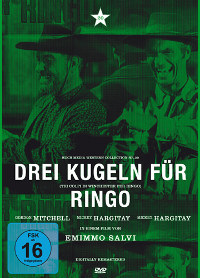
Anyone noticed this?

It says Mickey Hargitay two times :D.
[quote=“Silence, post:444, topic:50”]Anyone noticed this?

It says Mickey Hargitay two times :D.[/quote]
Isn’t he this body building type? In that case he needs as many room to breathe as two normal people
Guess so.
Don’t worry these preview covers often have such errors. At least not the first time for an announced Koch DVD.
One of the 2 others has a letter missing in one of the names.
Thans a pretty big error if you ask me…how do you do that kinda mistake?
I guess you get 2 Mike Hargitay’s for the price of 1. :-\
Perhaps they have been on the beer ![]() .
.
haha, i’m about to be on the beer
Enjoy my friend  .
.
There we got the explanation!
And why do they continuesly use that film role repeating pattern? It worked for the covers of say Yankee, Arizona Colt, Quien Sabe, and some toehrs, but it looks like shit for most of em now.
Sorry to disagree but I really like them. I especially like the three coloured pictures on the back of all of them, just a nice design.
I like them too. It’s different to others.
I don’t dislike them all. Just some don’t need the repeating pattern. But on a whole they’ve got good covers.
The new Koch covers do look like shit but that said as long as that is all that is wrong I have no complaints.
They probably have 10 pfennig allocated for cover design and simply just grab a still from the movie give it a random insane color and if it just isn’t the right size just doubles or triples it and voila instant cover… You can call that nice design I call it expense reduction.
But as said a billion times the content is what counts and here Koch Media usually comes through.
I don’t think their new way of doing their covers is too beautiful, but meanwhile I like it. Only I think that many of the photos they use are quite ugly. The SW is a very visual genre and there are lots of great stills to find in these films, but too often Koch uses rather clumsy looking ones. Yankee is a very unattractive one while Cjamango is one of the best.
Same here. For the most part i like them but the ones with the repeating pictures don’t look too good. And for some reason i just don’t think the silver colour was good for Return Of Ringo! ![]() But at the end of the day, the disc contents are always good quality and a very reasonable price so the covers are a small complaint.
But at the end of the day, the disc contents are always good quality and a very reasonable price so the covers are a small complaint.