With the SWDb software update comes new motivation to finally (after years of neglect) give the database some overdue cleanup, optimization and improvement. We want to fix up old pages, make articles look better, ensure visitors can find what they’re looking for, and we want to add pages, links, images and other information or tweaks that will make the SWDb better than ever before.
This topic is a wiki topic itself, meaning anyone can add to it, or cross off items that are done.
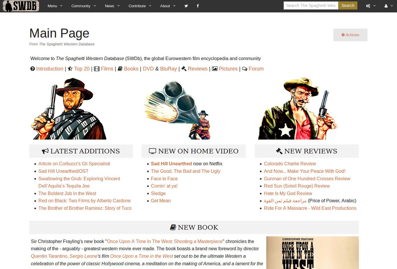
Main Page was modernized ( ), still to do: bottom right corner explore link cloud.
Sebastian needs to overhaul the main menu: what is missing in there, what can be deleted, do we need an additional menu item? in progress
Sebastian needs to update all the disclaimer texts (privacy, about, copyright, etc.)
Sebastian needs to put some essential info into the footer of the website (e.g. where the MediaWiki logos is), link essential links, contact info, maybe sponsors…
Use bigger pictures on the Introduction page, and ensure responsiveness
For each movie, create a “censorship and versions” section reporting all information related to versions, censorship, cut scenes, etc., with references.
Add IMDb-type keywords to film pages (for instance Dynamite, Machine gun, Whipping, Duel, Bank robbery, Bridge, Civil War, Native American, Hanging, Drinking Milk, Beating, Parasol, Revenge, Surprise ending, Mexican Revolution), but be rigid and specific list to avoid an uncontrolled proliferation of uninteresting or repetitive entries
Uncredited actors marked with an asterisk or other graphic sign.
Overhaul plot synopsis for all films to be spoiler-free but at the same time informative.
Sebastian needs to remove that donations banner and replace it with something better (what could grace the bottom of all pages?). Done, now with a few helpful buttons
Hi. Quite simple: you have something to contribute - we’ll make it possible. Being an active fella here in the forums is already a great first step, the next would be to start editing the SWDb on your own. For that I can create an account for you, and going about it works just like the Wikipedia does (if you ever edited something there); because we use the same software.
Here’s a quick tour of what’s new on the Main Page and the header/footer areas of the SWDb:
First, the top half of the screen
I removed the background from the navigation bar, because it was close to impossible to see what it really was, it made everything very noisy and distracts from what’s important: the content of the page.
the menu is not quite finished yet, but as you can see there’s an additional item there, plus two social media icons
I removed any banners and graphics that came before the content (for now) - less that stands in the way of content. On the Main Page I also de-cluttered, made items stand out more and simplified it quite a bit under the hood. Those of you you have previously added info to the main page should still find your way around, it hasn’t changed much.
Gave the book highlight it’s own full box. All these boxes have little icons also, subtle but easy to recognize
The Main Page also looks really good on mobile devices now, all content is moved underneath each other then. Try it.
I still need to update the “explore” box with some more and better links, ideas are welcome. I just want to give as many entry points to great stuff on the main page as possible
I moved some of the banners and buttons to the bottom of the screen (newsletter, read more books, etc). I think it gives the site a nice finish at the bottom
the disclaimer links were updated (a new one for copyright) and I added social media links there as well. The texts in those disclaimer pages still need to be updated
That’s it for now, as you can see, no revolutionary changes but a series of minor tweaks that make the first page on the SWDb that most people see, look better and work better. Now off for the rest of the work, who’s with me?
Not on Wikipedia, but on my WordPress Blog multiple times I’d certainly be interested in the staff account, I’ve got some material I hope would benefit the site.
Personally I feel the main menu is very clean and tidy. I can easily navigate around the different columns and sections and figure out what to look for. Looks great!
At the “contribute Page” there could be a description about the “Amazon” contribution by clicking on a link from the forum and then place an order. All bits will help I guess.
Just some thoughts from me
1 Like
UncreditedExtra
(nameless, mean-looking & mostly killed in the first minute)
13
I do not write on the Forum that often, but am an avid user of both the website and the Forum.
Here’s some observations about the design of the website:
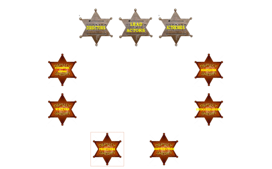
I feel the “Hall of Fame” coukd have a direct link on the starting page, maybe between “Pictures” and “Forum”; on a Laptop-screen there is easily enough space available to the right. I just never liked the Hall of Fame to be “hidden” inside of the Top 20, I do not find it self-explanatory and I also find it nice to have it more prominently placed (especially for newcomers to the genre and website, but also for honouring all those people)
The yellow writing on the sheriff-stars of the HoF-categories is hardly readable and rather unpleasant for the eyes.
I have some more ideas, but they are more content-based (Alternative Top 20, categories in the Hall of Fame), not design-based. Where can I post those? Or just send an email to you, Sebastian?
So we need someone who can come up with better ones, like a consistent design thruout the entire hall of fame, graphics that are legible, hi-res and can be used in different contexts. Anyone up for it?
UncreditedExtra
(nameless, mean-looking & mostly killed in the first minute)
16
Sorry for my slow answers, I do not write much on boards.
I know near to nothing about graphics, so I can’t help there. I think the graphics for Directors, Lead Actors and Actresses are not perfect, but at readable; the others are hard to read because of the contrast and small writing. Hope somebody with graphic skills turns up!
P.S.: May post my more content-based ideas for the site at some point, but do not have the time these days.
My suggestion is that when you click on a forum member’s alias you may see his current SW Top 30 or 40 or 50 or the like, naturally only if the member has posted such a list on the same personal area. That way you could get a better understanding of a review or short opinion about a certain SW and see what he or she thinks about a lot of other SWs and therefore see the input in a broader context. If someone writes convincingly positive of a SW and the Top 30 matches well with your own, then you maybe could predict that yourself would have similar opinoion. If the Top 30 seems quite different and you don’t like a lot of the SW, then your prediction could be more reluctant and wait with that movie.
 ), still to do: bottom right corner explore link cloud.