I think now we should the release date and versions/runtimes section further up…
@Phil_H @scherpschutter @Carlos @Mickey13 @last.caress @aldo @Bill_san_Antonio @Bad_Lieutenant @Dean @ENNIOO @ElDavido @Novecento @stanton
What do you all think about how the Django page looks like right now?
All looks good to me.
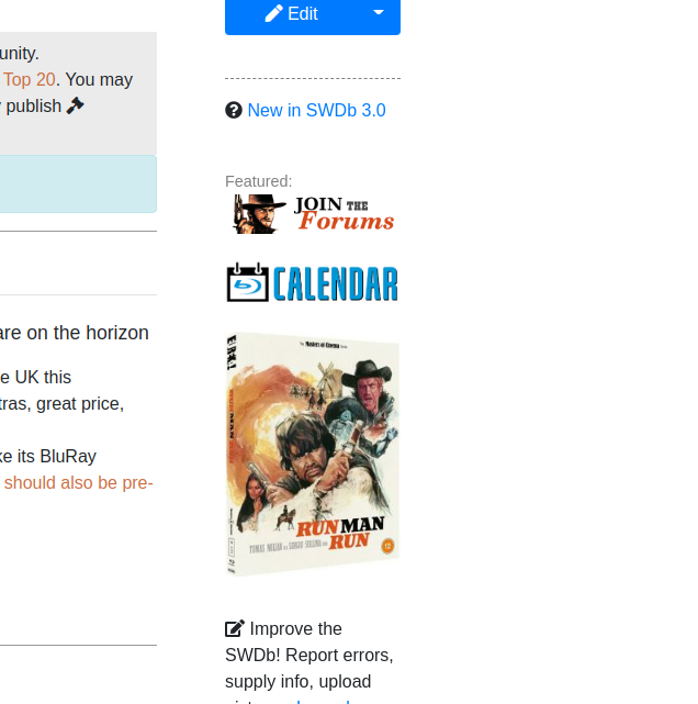
The only thing I notice is the Release Calendar link which sits down the side on laptop and at the bottom on phone. This needs to be a much narrower design as half is lost on either device. Just see “Release Cal”
ah, but it really just says release cal  but point taken, I think I need to design a better button for this.
Definitely
1 Like
I will also do another one for Forums that’ll be easier to read. But you find no issues with the Django page layout? I am awaiting some more feedback and then I think we can start rolling out. Carlos’ feedback has been instrumental so far…
Snazzy and meticulous. Give it the nod from me.
1 Like
The external links reviews are kinda close together on one line. Should they be separated more? like this maybe?
When the page is shrunk down like on the phone, the ‘Also known as’ comes to the top of the poster. Do you like this? is there a way to get this below the poster?
looks good, or a plain list
I actually did that on purpose. Alt titles (also for search purposes) are more important than the poster…
1 Like
Hmm… I think all those icons are distracting. Maybe just because I’m used to old simpler look but I wonder how it looks for average browser.
good point. I will see if we can maybe decrease the size of the icons within the headers a bit, that might improve your experience and make it a tad less distracting… let me try. On the Django page, they are now two sizes down. It is subtle, but it makes them less dominant. What do u think
is that a bit better @Bill_san_Antonio ? @Carlos if you like that, too, we should apply it like this
1 Like
Better yes. The more I’m watching this page, more I’m getting used to the look. Btw I’d remove the texts “watch” and “legacy releases” from the link box. I mean isn’t that what’s the icons are for?
I would really like to hear a few more reactions to our Django page before we start rolling out. We can’t redo all pages conceptually again if we encounter glitches, better to notice these now and then roll out a concept that really works well. So please look at it, let us know and post your feedback on here, and then maybe we can start rolling out the top 20 over the holidays already.
any more feedback?
Otherwise, @Carlos , we should implement the icon resize also for the other two test pages we have so far (I can do that) and then start rolling out…
I noticed that we have no dedicated “awards” category, but not sure how many spaghetti westerns even won awards… so those could go under Trivia probably
Is La resa dei conti page correct now?
We are using the Django page as the pattern now rather than the Main Page/filmseite page?
yes but I can have a look at all three tomorrow, bring them up to speed and then let you all know, along with some tips on how to proceed
Once last thing I am not sure about: the very first line of text on the page. Originally I envisaged a much more “talkative” intro to each film that is a complete sentence or more than one, like “XY is as spaghetti western by so and so that premeired in 1965. The highly influental film bla bla bla”… but not all of our movies, and in fact just a minority, we’ll have enough to say about to even write a few sentences to start the page with. So how exactly should the first line of text be? It will likely pop up in search engine search results and when you share it on social media et…