Looks you want to keep all the headers, to be filled in later if no info exists yet
not necessarily, but I was hankering for an activity during tomorrow’s breakfast, haha.
Generally, I think for most of the major movies we should have plenty of content for all sections. On others, we can leave out the sections we have nothing for, but keep the order of sections so users always find them right.
Question: keep external reviews under external links? could be that if we move them to reviews there is nothing under external links. but there are things on the web that are valuable external links that arent reviews…
Either way. You moved them up in Big Gundown but the test page has them under ‘External links’ which may make more sense ![]()
if it makes more sense then we do it that way, see, that’s why I like feedback, not everything I do makes sense 
I think I have made up my mind how I want to do the roll-out:
- we do it slowly. There is no need to try and apply this to 700 pages in a matter of weeks.
- we do the most important film sites first, starting with the top 20, and so son.
- we take our time with each film we update: in the wake of applying the new style, we use that as an occasion to add pictures, find links, fill some gaps in the information, weed out dead links, polish the synposis, etc. so that we’re not just changing the look, but also the quality of the information the SWDb offers. Also then it doesn’t become a mindless editing job, it more neatly integrates into our constantly ongoing gradual improvement where several people fix things here and there all the time.
1 Like
Here is something of a checklist (with tips) in order to apply this to other sites:
- start out with the Django page and apply its markup code to a film page that should be upgraded. You can do this by moving all the existing markup code further down to start; another way is to do this on a temporary subpage, e.g. “…/new” first and apply it to the actual page only once you’re happy with it and maybe a second editor has also had a look at it
- the NOTOC needs to be removed in the end if one exists
- we leave out sections that we have absolutely no information on with the movie at hand, but if it could be included in a day or two, we leave it (e.g. there is currently no censorship and version info on the page, but there is some in the imdb, on moviecensorship.com and already on the /DVD subpage, so it could be easy to finally add some info about existing versions)
- if we haven’t already, we remove all external links to sites that are already dead (e.g. shobary, etc)
- have a look at how the links are to be included for the little icons at the bottom of the page (imdb, wikipedia, etc) and if there is no link (not all movies have wikipedia entries), leave a “link=”
- double check that the movie poster gets and alternative text “title of the film movie poster” and it’s high res enough to become full width of the browser window on a smaller device (that means one step to take after transforming the site is to open it on a cellphone, to be sure).
- watch out, some BluRay subpages are at /BR instead of /BluRay
- for each film page we finish, we should post in the films discussion topic to announce it and use the occasion to ask for additions, corrections, pictures, and other info to be added or contributed
For now we have Django and The Big Gundown migrated, I would love to have some others take a look at these and give us some feedback before we tackle the next ones. Especially, I think we should take the opportunity to look at the film pages we migrate and add more pictures, links, info, etc… use it as an opportunity for quality improvement in general. For example, for The Big Gundown, all we have are German VHS covers… that can’t be it ![]()
Now that I’ve done an update a couple of thoughts (feedback) on the top layout
current layout
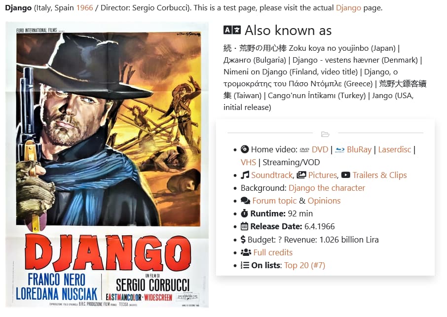
- the separating line with the ‘open folder’ icon should be darker with a header
- this should be a menu to the sub pages, there’s no need for ‘Runtime’, Release Date’, ‘Budget’ here as they have their separate sections below
- let the icons do their job, no need for headers ‘Home video’, Background’, ‘On lists’
- separate the second line, their own lines
- Django had a ‘Comment’ which is not here, a lot of pages currently have a user comment section. How do we handle those? move to the ‘Opinion page’ or make a ‘Comment section’?
- is there a way to have the “fas fa-” icons to have hover property? when user points his mouse at the “fas fa-compact-disc” it pops with “Video” for example. I’m not good with HTML

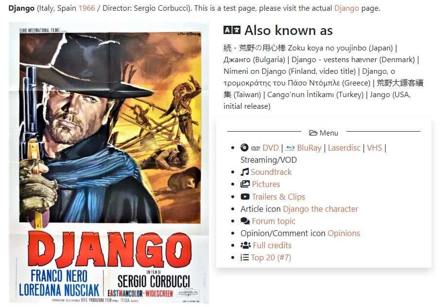
Here is a screenshot with my changes:
1 Like
are you sure? I don’t see one comparing it to the pre-update version.
I am looking into your other suggestions.
1 Like
You’re right. The comment was taken out some time ago, probably one that was copied from another site ![]()
Implemented most of your suggestions on the Django page. Made me think to change the release dates section headline, and word the first line on the article page a bit nicer. Not sure yet about naming the box “menu”, as there’s already a “contents” in the sidebar… maybe even that is self explanatory? I split the dvd/bluray from the “old” media…
Some other tasks I have carried over from the old 2019/2020 “improvement mission” that I don’t consider quite done yet
- Sebastian needs to update all the disclaimer texts (privacy, about, copyright, etc.)
- ensure responsiveness on the Introduction article
- Debatable: Add IMDb-type keywords to film pages (for instance Dynamite, Machine gun, Whipping, Duel, Bank robbery, Bridge, Civil War, Native American, Hanging, Drinking Milk, Beating, Parasol, Revenge, Surprise ending, Mexican Revolution), but be rigid and specific list to avoid an uncontrolled proliferation of uninteresting or repetitive entries
- Overhaul plot synopsis for all films to be spoiler-free but at the same time informative.
I think now we should the release date and versions/runtimes section further up…
@Phil_H @scherpschutter @Carlos @Mickey13 @last.caress @aldo @Bill_san_Antonio @Bad_Lieutenant @Dean @ENNIOO @ElDavido @Novecento @stanton
What do you all think about how the Django page looks like right now?
All looks good to me.
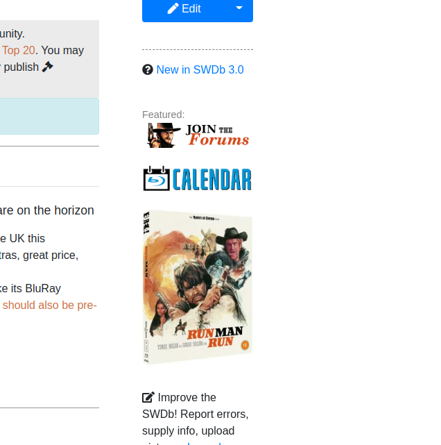
The only thing I notice is the Release Calendar link which sits down the side on laptop and at the bottom on phone. This needs to be a much narrower design as half is lost on either device. Just see “Release Cal”
ah, but it really just says release cal  but point taken, I think I need to design a better button for this.
Definitely
1 Like
I will also do another one for Forums that’ll be easier to read. But you find no issues with the Django page layout? I am awaiting some more feedback and then I think we can start rolling out. Carlos’ feedback has been instrumental so far…
Snazzy and meticulous. Give it the nod from me.
1 Like
The external links reviews are kinda close together on one line. Should they be separated more? like this maybe?
When the page is shrunk down like on the phone, the ‘Also known as’ comes to the top of the poster. Do you like this? is there a way to get this below the poster?